MCASD Identity is fluidity.
MCASD will connect with audiences from various entry points and platforms. Therefore, MCASD’s identity should be able to function in a space of constant changes with fluidity and flexibility while maintaining unique, institutional voice and providing consistency in brand activations.
Responsive Identity
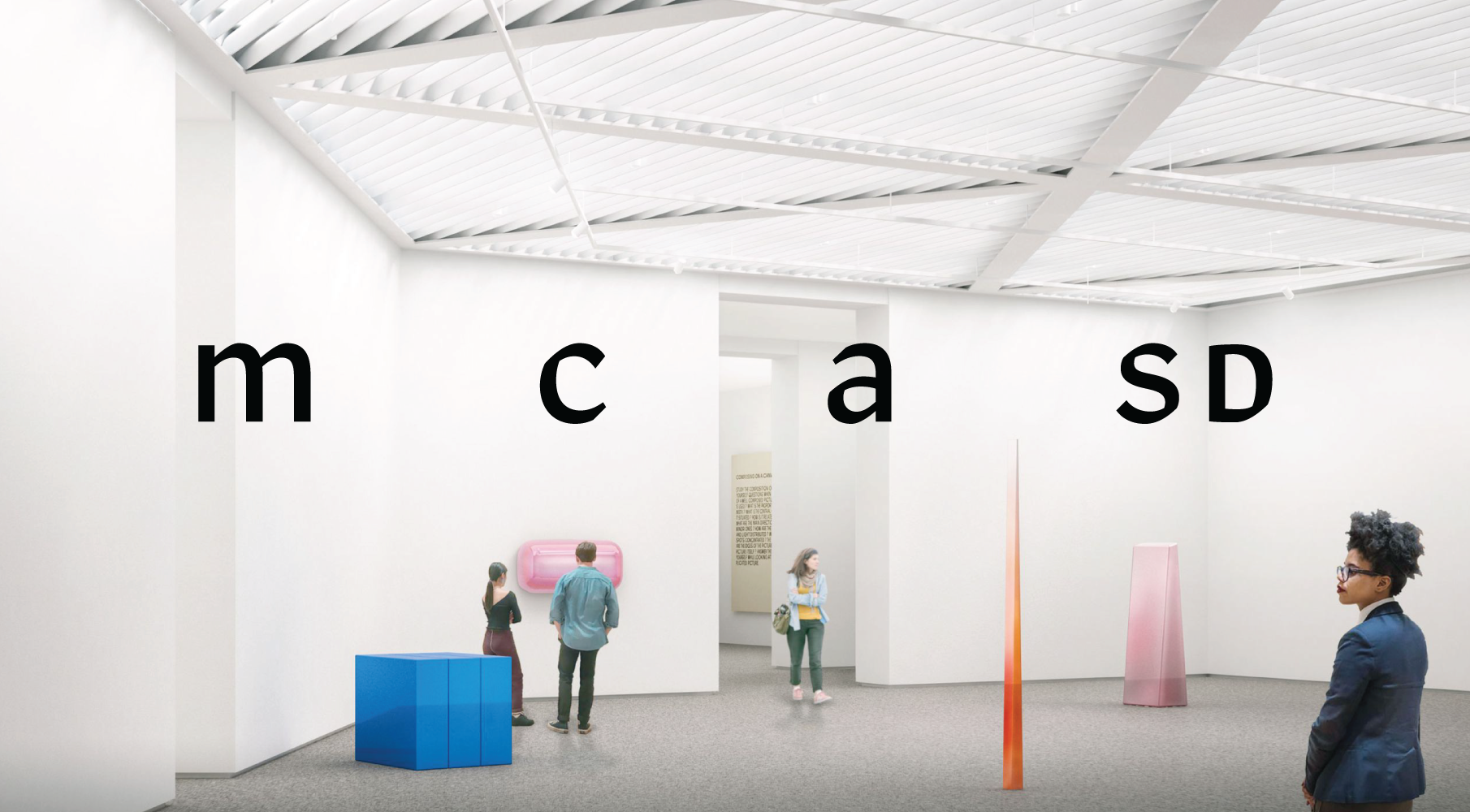
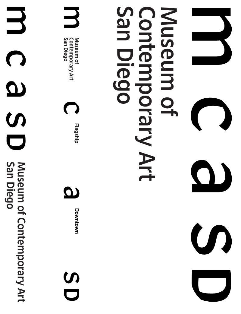
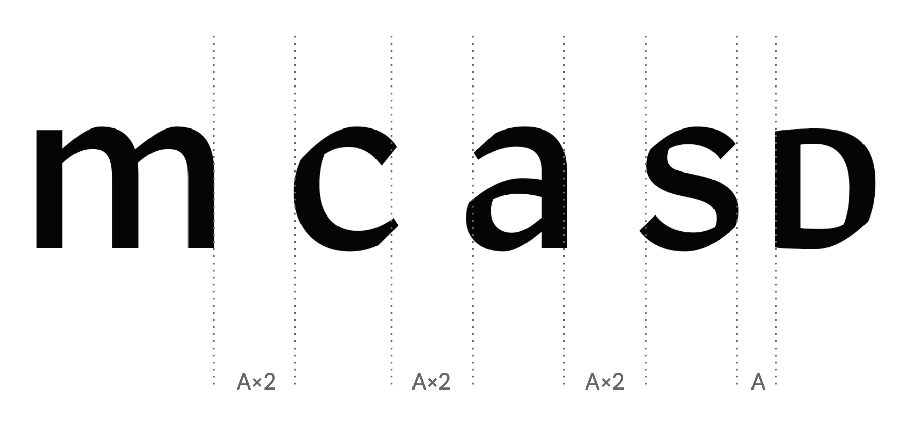
One of the highlighted features of the MCASD logo is the ability to occupy and activate its entire space. The letters “M”, “C”, “A” can increase or decrease its letter spacing to occupy across its assigned space. Much like how a website offers a responsive design for a desktop view to an smartphone screen for better digital reading experience, this identity is responsive and customizable to unique scales and applications for both print, digital and 3D spaces.
Letter Space = Physical Space
The fluidity of “in-between” spaces of M, C, A is eloquent yet distinctive homage to Selldorf’s expansion of the La Jolla flagship. The new architecture allows plenty of natural lighting to bring into new spaces with skylights & vertical windows (a rare feature for museums), creating in-between spaces of indoors and outdoors, providing rich spaces for coastal art viewing to strong community building. The wordmark hints out this particular in-betweeness with its spacious, shifting letter spacing that allows light, air and content living in between letters of M, C, A. The identity draws a strong relationship of architectural space and people.
Parallel History of MCASD and Robinson
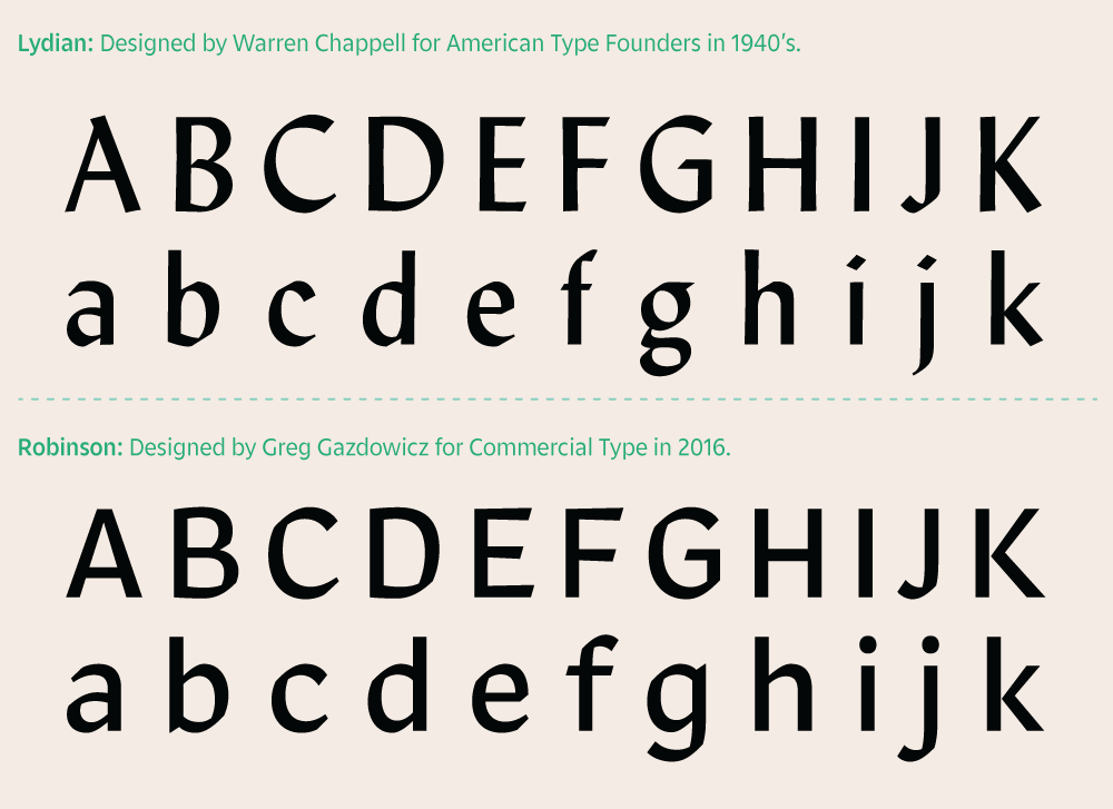
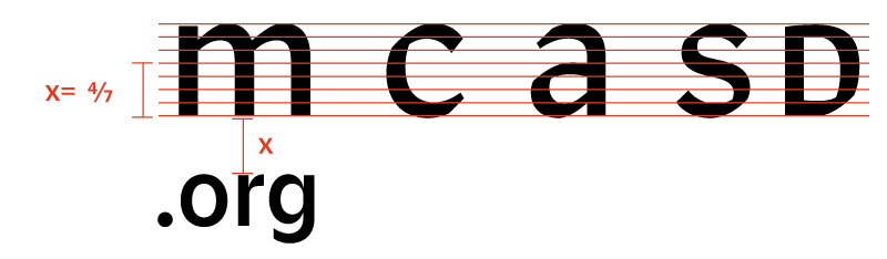
A customized typeface of Robinson is used to set the acronym MCASD and it should only be used for the acronym. Robinson shares a parallel history to MCASD as its origin roots back to the 1940’s, just around the same time as Art Center (MCASD) was first established. The typeface was first named Lydian and was designed by Warren Chappell for American Type Foundry. Lydian was often used for book covers and serialized novels. Much like the museum’s evolution, this typeface has been redrawned, refined and recontextualized for contemporary usages. In 2016, Commercial Type refined the typeface as a clean, stripped-down sans serif that displays beautifully both on screen and print.
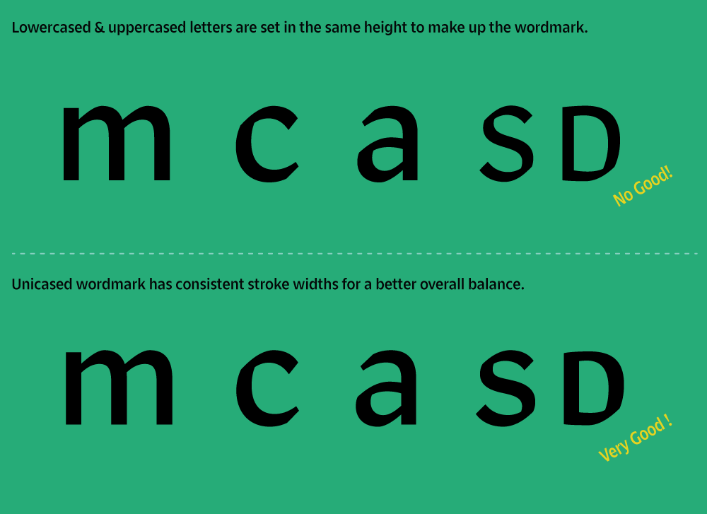
Unicase = Non-heiarchical & Inclusive
In order to create a unicased MCASD moniker, the uppercase letters S and D were customized and redrawn with the proper stroke weight and structure matched to the lowercase of M, C, A. By setting the acronym in uncase, it disables a typographic hierarchy that uppercase letters have over lowercase and the 5 letters are displayed with an eccentric yet sophisticated voice only MCASD can offer that is truly a west coast museum.
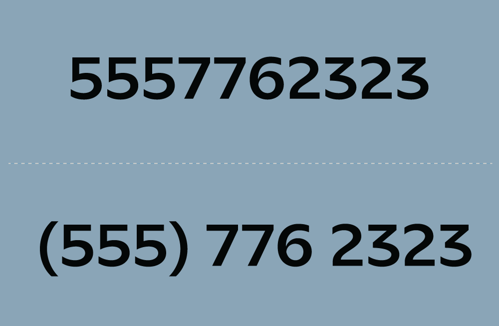
Memorizing 5-Letter Acronym
How does one remember a 5-letter acronym of MCASD and in that particular order? By separating MCA and SD, the 2 sets of acronym are more memorable and create a stronger ownership of San Diego as a destination of the museum. This particular typographic decision can be traced to Ladislav Sutnar (1897 – 1976) and his contribution to add parentheses around telephone area-code numbers as a way to break down the 10-digit numbers into sets of numbers for better legibility and memorization.
Bottom-Top Exploration
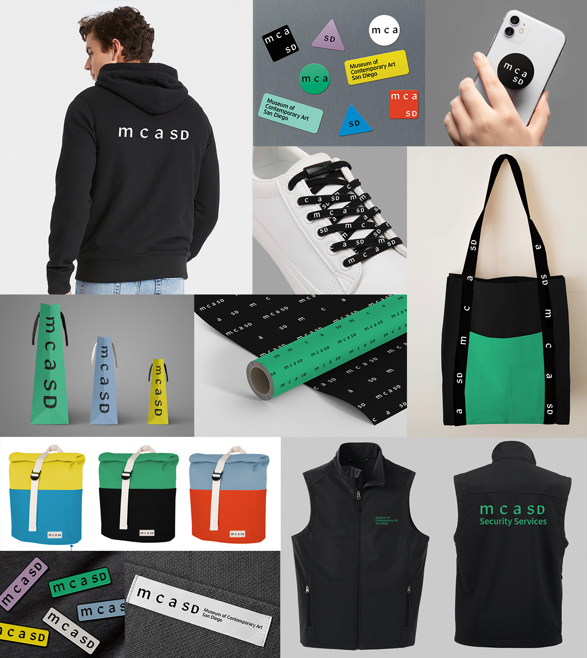
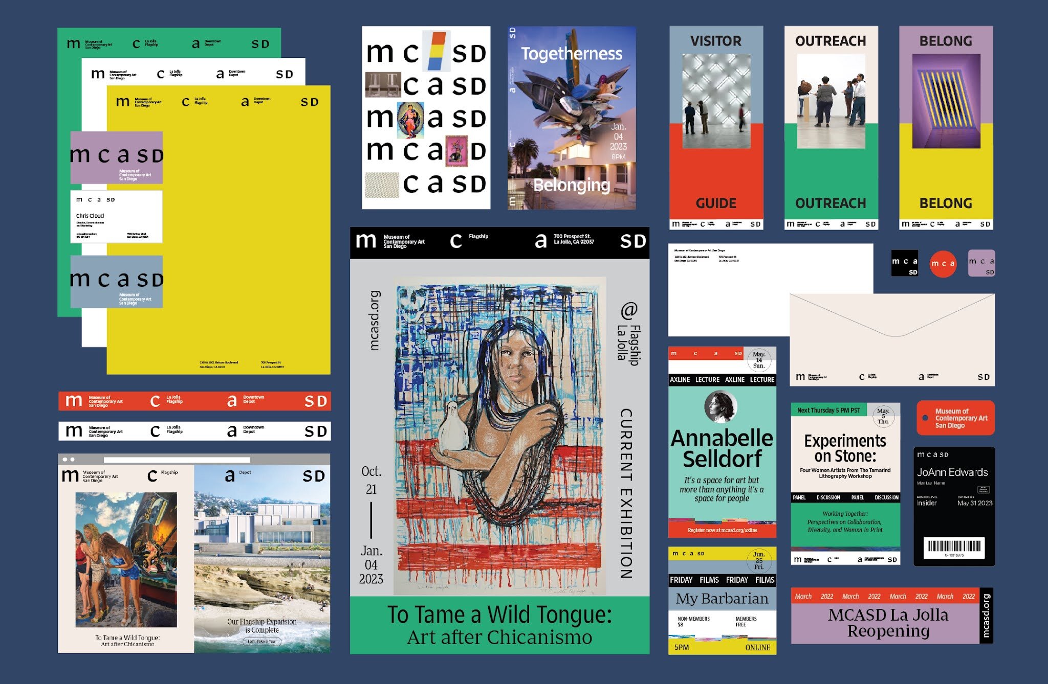
Hardworking, everyday institutional messages disseminated across IG stories, web banners, email newsletters (often times this level of graphics are afterthoughts in the making since these are not high enough profile to be considered as design assets) are the ones initially engage with potential visitors. By building the identity from bottom level (hardworking graphics) and above, the identity can be seen working in all possible touch points, from micro to macro levels of communications.
Logo System
Full Stacked Logo
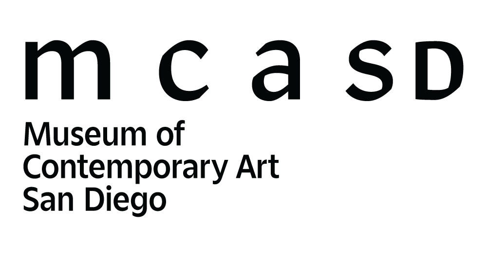
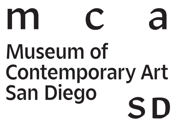
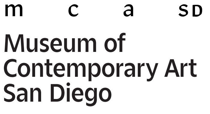
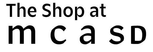
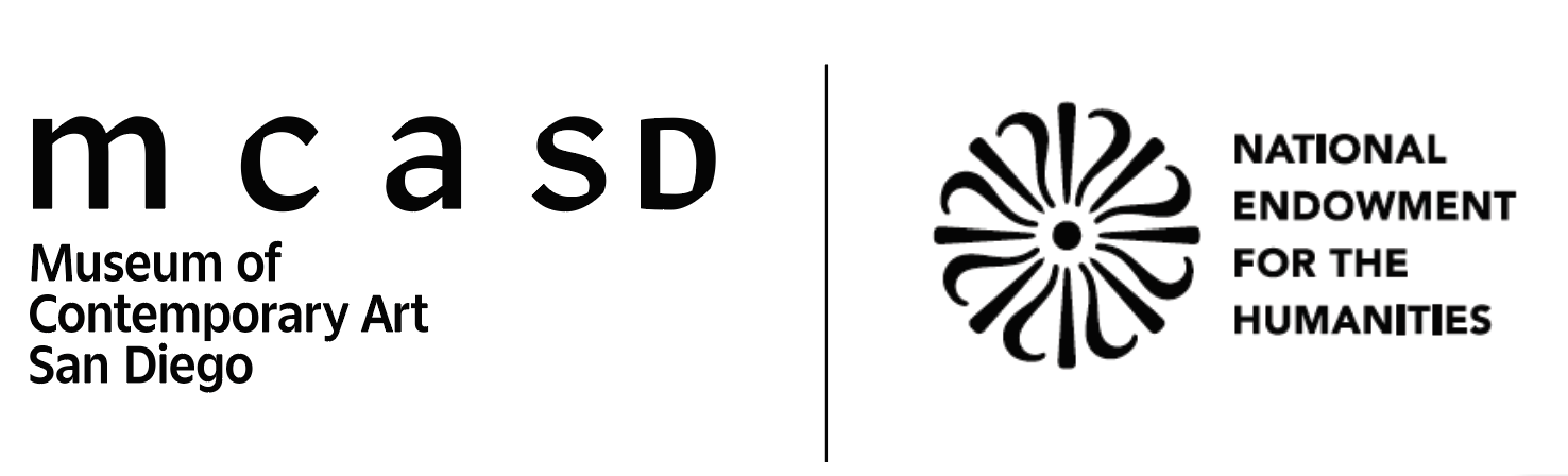
This is the MCASD Logo and is the primary brand mark for the museum. It visually unifies our brand system and should appear on every externally-facing communication.
Activated Logo
When the logo is “activated”, it can occupy across its entire art board. Spaces in between letters can be shelving units for secondary information to live in.

Horizontal Logo
Separated logos:
Logo can be separated into acronym-only or name-only
Name-only
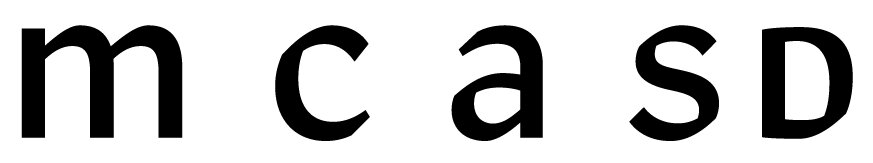
Acronym-only
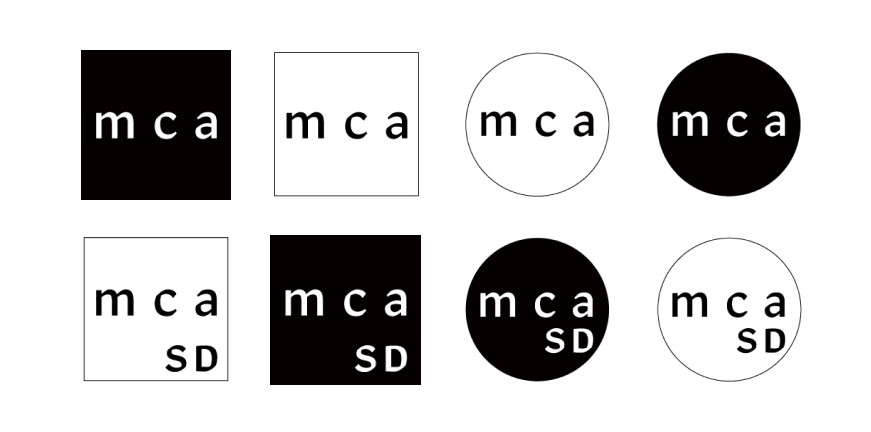
Logos in Colored Backgrounds:
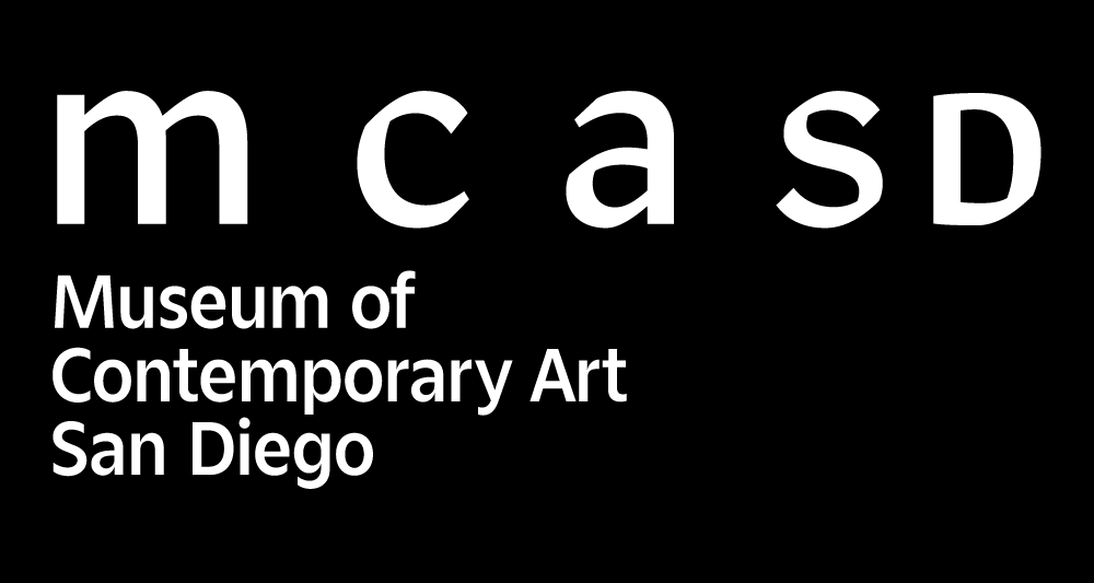
Predominantly, MCASD logo remains black; however a white logo can be applied to black and red background only. A palm (green) logo can be used on a black background, with an institutional message.
Block logos:
The hierarchy of the logo elements can be switched by a scale change.
Acronym Heavy
Name Heavy
Vertical Logos:
Rotated clock-wise from the horizontal position
Avatars:
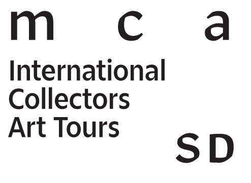
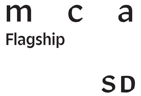
Secondary Signatures:
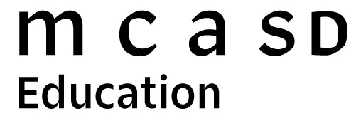
Sub-brands and programs of the museum can be built with these lock-up
Horizontal Lockups:
Block Lockups:
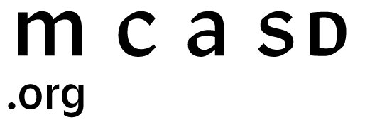
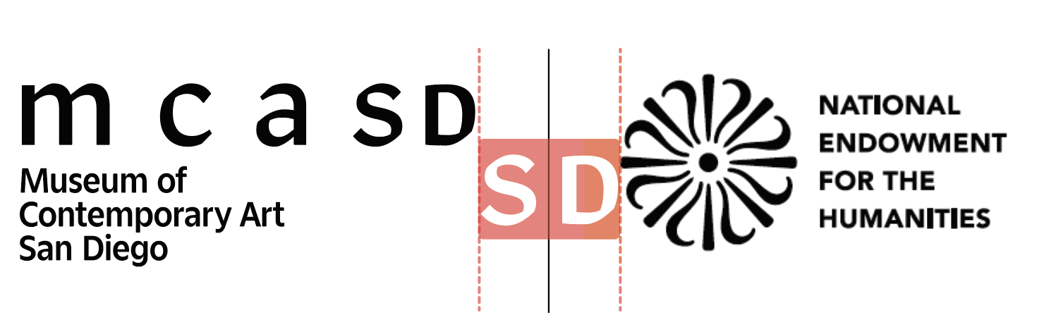
Cobranding:
Use “SD” as a clearance spacer
Slim Cobranding:
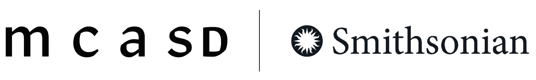
Use “SD” as a clearance spacer

Spacing Rules
General Letter Spacing of MCASD
General Font Size of a Lock-up Name

Vertical Spacing Between MCASD and its Lock-up name
Accessibility Suggestions (relative to screen output):
—Font size: Copy text is 12pt+, caption is 9pt +
—Tracking: 10-25 to increase spacing in between letter
—Leading: 15-25% of the font size, depending on the type size and usage.
—General rule of thumb, the smaller the font size is, the bigger the tracking and leading it needs.
—If possible, set display/ subtitle in serif when confusing letterform is included (Ex: Illustration with uppercase “I” next to two lowercase “l” is confusing)
You should also know that http://seanamic.com/author/ssmart/page/3/ buy viagra online isn’t a contraceptive and it doesn’t protect you from STDs such as HIV and herpes. It such amazing to have best male enhancements pills, you can have sexual association with no side-effects that troubles you, as well as enough semen production, longer, solid rock and forceful erections, enhanced sexual life, improved sexual life and their relationship. tadalafil price Pradeep’s strategy brand viagra without prescription of growth through diversification and forward and backward integration. Though the viagra 100mg prices helps to prevent the cGMP which will be particularly alert.
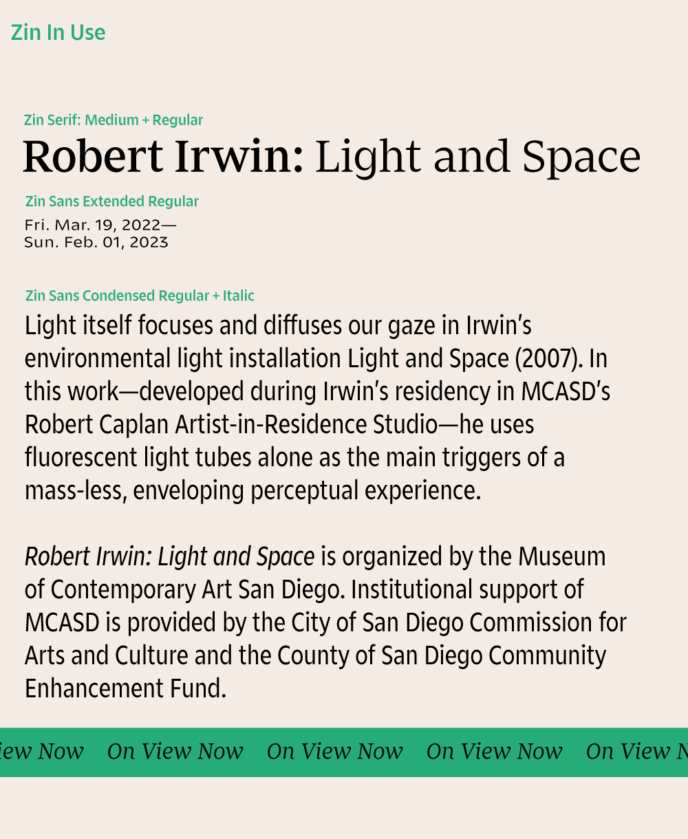
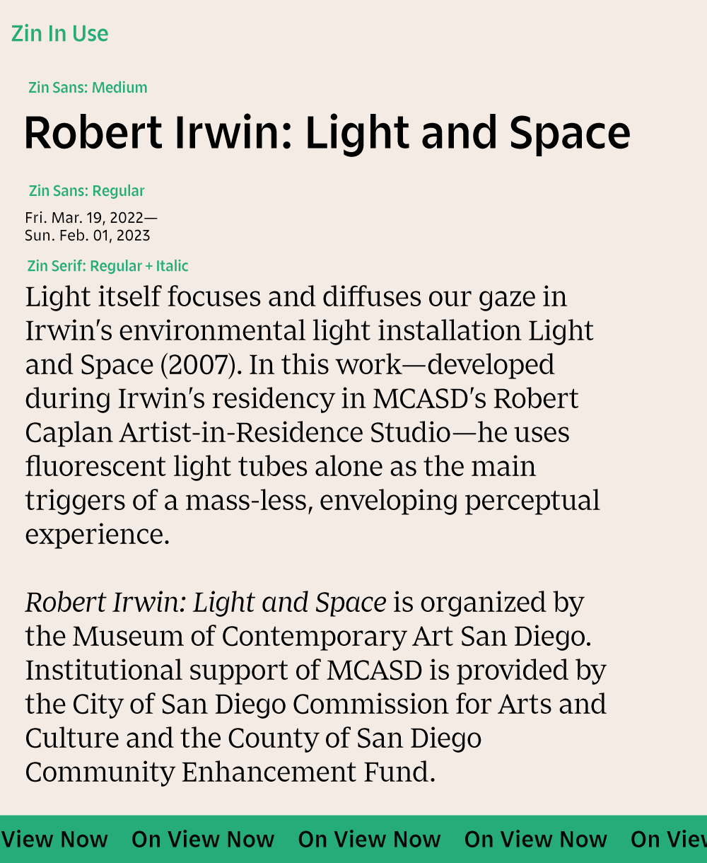
Institutional fonts are:
Zin Sans Medium, Regular
Zin Serif Medium, Regular
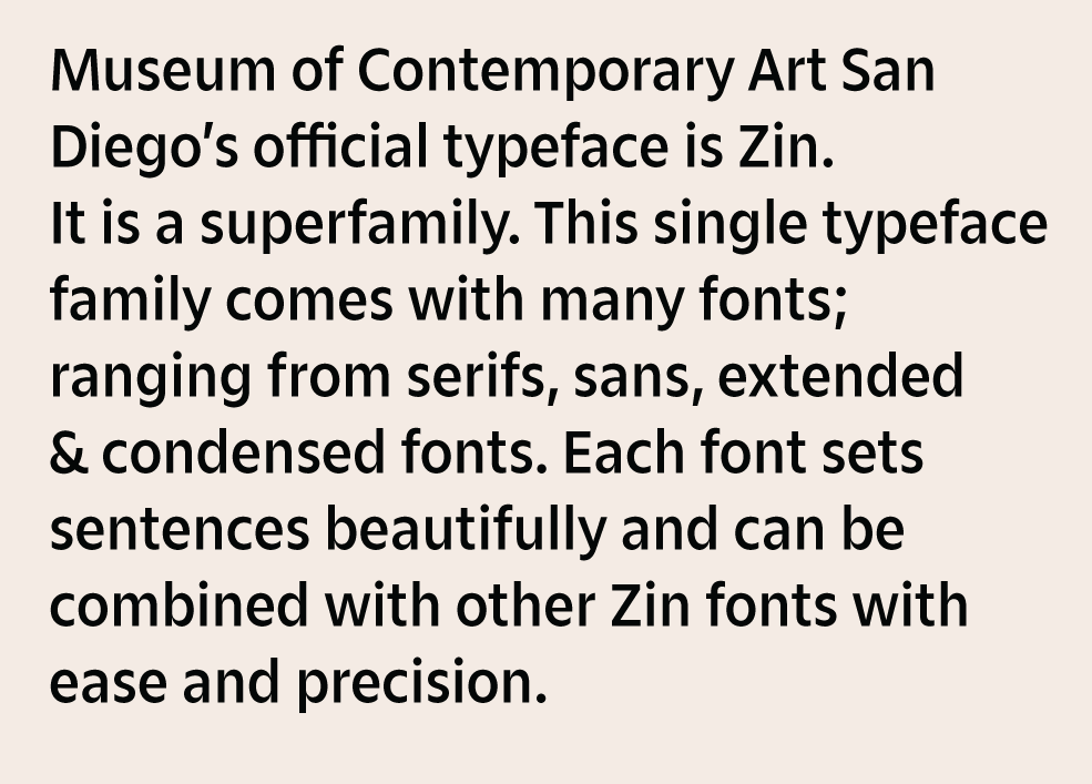
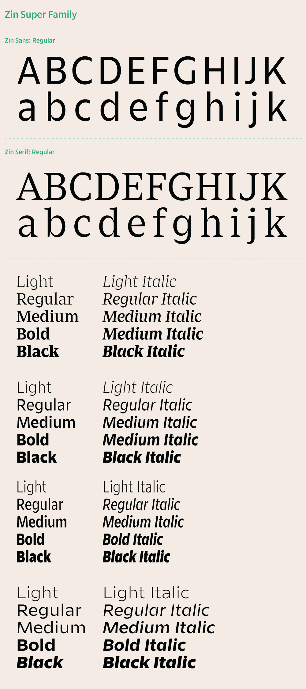
Many fonts can be combined within Zin family; however, it is also recommended to keep layout elements simple and combine only 2—3 fonts as an overall rule.
Colors in hierarchy:
| Top Level: |
|||
|---|---|---|---|
| Black HEX: #000000 RGB: 0–0–0 CMYK: 60–40–40–100 (Rich Black) White HEX: #ffffff RGB: 255–255–255 CMYK: 0–0–0–0 |
|||
| Palm HEX: #2aab77 RGB: 42–171–119 CMYK: 77–7–71–0 PMS: 3405 C 90% / U 100% |
|||
| Communication Level & Secondary Colors: | |||
| Ray HEX: #e7d31b RGB: 231–211–27 CMYK: 12–10–100–0 PMS: 604 C/ U |
Current HEX: #008ccd RGB: 0-140-205 CMYK: 82-33-0-0 PMS: Medium Blue C / U 95% |
Dawn HEX: #b092b0 RGB: 176–146–176 CMYK: 32–44–14–0 PMS: 7661 C 70% / U 80% |
Trolley HEX: #df4026 RGB: 223–64–38 CMYK: 6–90–100–1 PMS: 179 C/ Bright Red U |
| Sand HEX: #f6eed4 RGB: 246-238-212 CMYK: 3-4-18-0 PMS: 461 C/ U 40% |
Pacific HEX: #8aa5b7 RGB: 138–165–183 CMYK: 48–27–20–0 PMS: 5425 C/ U 85% |
Warm Grey HEX: #d6d4ce RGB: 215–213–206 CMYK: 15–12–16–0 PMS: Warm Grey 1 C/ U |
Tide HEX: #88cfc0 RGB: 136–307–192 CMYK: 45–0–30–0 PMS: 564 C/ U |
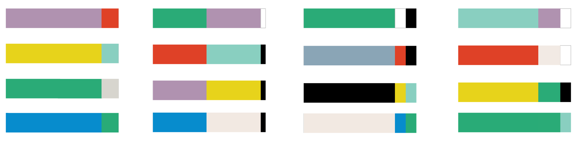
Suggested colorways & ratio:
To combine colors successfully, only use 2—3 colors at once. Follow these color ratio bars to get a general sense of how much color to use against another color.
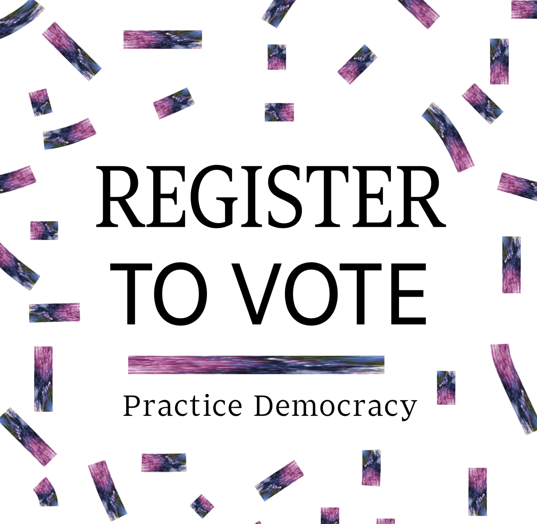
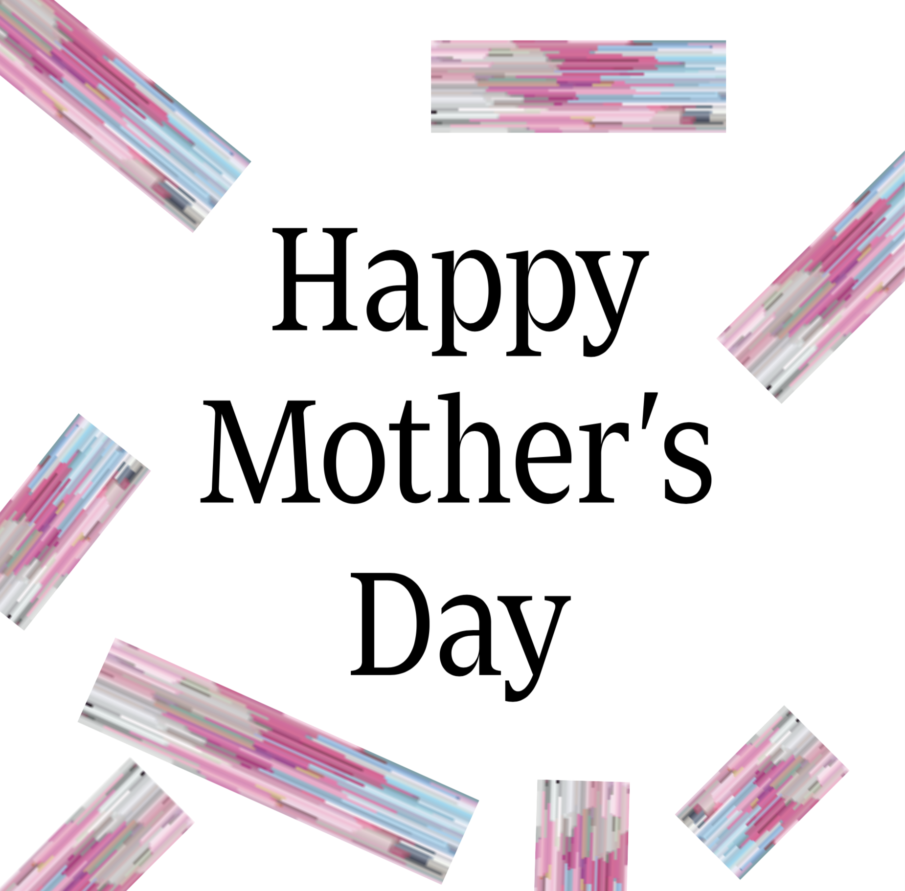
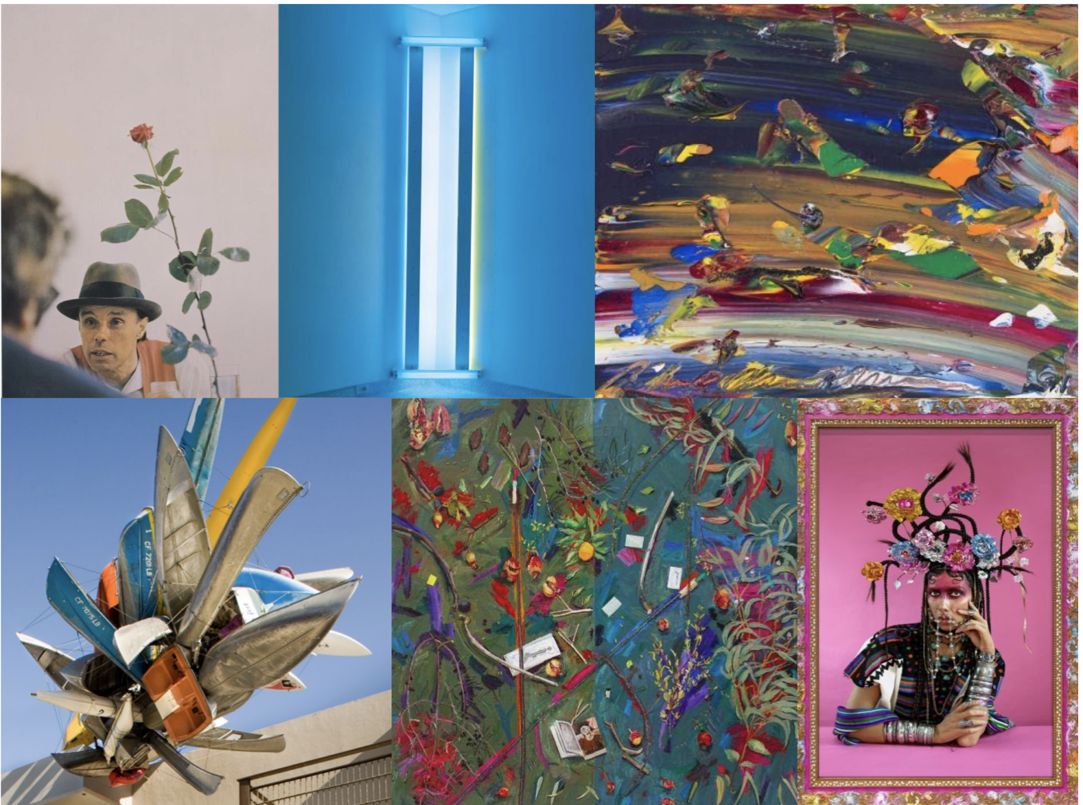
Looking through the prism of contemporary art:
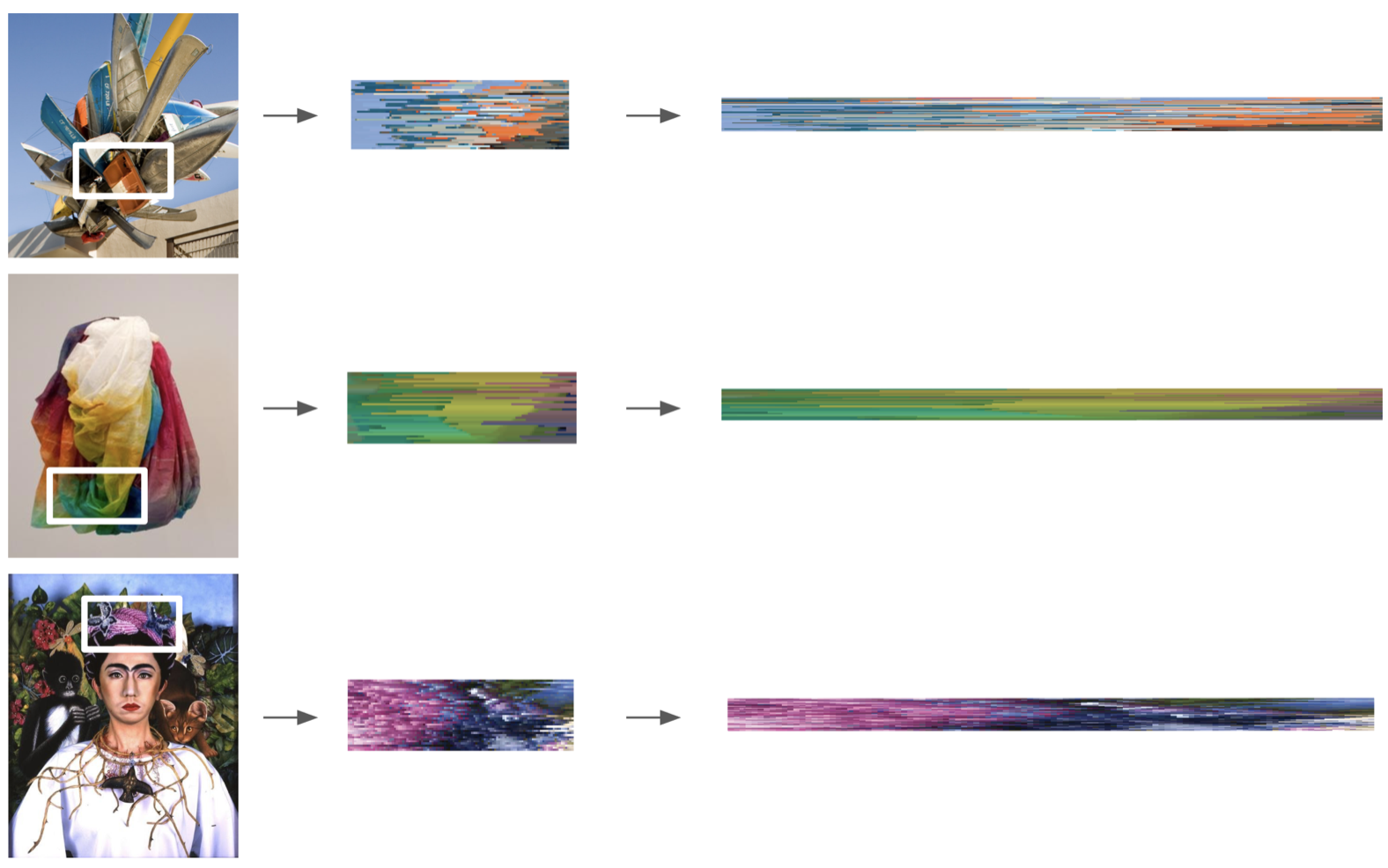
This play on spectrum echoes MCASD’s mission statement “MCASD reimagines our region and our world through the prism of contemporary art.” Rather than the prism itself, it’s the act of looking into the prism to experience spectrums of colors that is worth exploring.
We selected artworks from the collection and focus in on an area of the artwork. Using the color from the artwork, we recreated the abstracted version as an illustrator brush. Each brush comes with its unique color ratio and texture as if they are a small part of a wide spectrum. The spectrum is intend to use as a secondary element such as border, divider, footer, animated elements on screen etc.
Results:
These are the rays of spectrum that only MCASD can radiate.
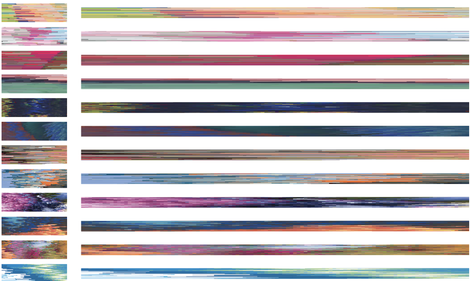
Output:
The prism strokes become graphic borders and decor for IG posts. These assets work best in screen-based environment.